It is very interesting to see how artists have been representing artificial light over the years and especially since the creation of the light bulbs in 1879 by Thomas Edison. Light has been a recurring theme in many sorts of art, beginning with representations of daylight, through artificial light as candles and gas or oil to electric light and the use of electric light itself as a means of art expression.
While researching for this post, I came across a very broad theme – this is also why I have taken so long to write – and I am sure this post alone will not cover everything there is to it. This means that we’ll have at least a few of these posts, analysing how different artists make use of their work to represent light in a certain context, which is definitely good news!
In this post, I will concentrate on the representation of electric light in a few paintings from the end of the 19th century, beginning of the 20th century as this was the time electric lighting came about and was wildly spread in the world. There are a few aspects to representing light and lighting in paintings that I will quickly summarize at the end of this post and which will be referred to in upcoming posts.
For now, I have chosen 3 paintings, which will be analysed in terms of the lighting conditions and quality that seem to be central in the story telling of the image. I’m sure most of you will probably already have seen these images, so I am confident I will be able to take you through this journey with me.
First of all, there were a few things I wanted to analyse for these first 3 paintings (which will appear again as we run further analysis) that will be used as a means of comparison between them. The analysis will look at the following items:
- painting elements: what is the scene about, what are the main elements composing the image?
- how’s the light in the scene: direct, indirect, reflected, can one see the light source, etc.
- what’s the character of light: dominant, secondary, soft, hard, etc.
- dominant colours: dark colours, light colours, colour of the light, etc.
- interesting bit: is there something interesting regarding the light or lighting in the image that is worth mentioning?
With that in mind, let’s go through the images as we progress in history. The first image is from 1889 from Leo Lesser Ury and is called “Leipziger Strasse”. If you are interested, the history of the image can be found in Wikipedia.
This image dates 10 years after the invention of the light bulb, as mentioned previously. By that time, it is great to see that street lighting was already being applied in streets, as Lesser Ury has depicted here. Analysis:

> painting elements: chariots with lanterns on a busy street, two ladies dressed in long dresses are crossing the street with an umbrella. There are street lights and a stone portal on the left which is probably showing the entrance to a park. It is a rainy night.
> how’s the light: very white direct street lights and their reflections onto the wet street, orange-like lanterns attached to the chariots. A red dot and its reflection in the centre of the picture and on the left hand side bring more colour to the scene. Dimly lit facades appear at the back.
> character of light: Neutral to cold white street lights seem to be very bright, reinforced by the strong reflections on the street. The orange-like lanterns seem to be much softer in comparison.
> dominant colours: most of the image is in black, the lights are represented in white and yellow and there’s a touch of greyish-blue and red.
> interesting bit: the colour difference between the street lights and chariot lanterns is suggesting how much brighter the former is. The Leipziger Strasse was the street where the first electric street lights were installed in Berlin in 1882. That alone would be a good reason for Lesser Ury’s painting in 1889.
 The second image is from 1895 and also from Lesser Ury. It’s titled “Im Café Bauer” and is representing an interior scene inside a Café in Berlin. Actually, there are a few paintings from Lesser Ury titled “Im Café Bauer”, as it was a known coffee house in Berlin. I chose this one here, because it is quite intriguing in terms of the lighting represented in the scene. More on the image, also on Wikipedia. Here’s the analysis:

> painting elements: A man and a woman seating with hats at a table in a café close to the window at night. The man smokes cigar, the woman seems to be listening while stirring a white cup (probably porcelain?). The colours on the windows suggest a lively urban environment outside. The couple seems to be concentrated in themselves.
> how’s the light: Direct and diffuse. There are two light globes which can be perceived by the reflections on the window pane with a neutral to cold colour. Apparently, and judging from the historical image from the Café above, one of the light globes represent the street lighting. Or are they both street lights?
> character of light: Although the scene shows a lot of contrast, the light is dull, diffuse. Only the bright surfaces (window frames, faces, hands and table) are shown giving the impression of a dark ambiance. There are no shadows casted.
> dominant colours: black, white, a bit of red and yellow.
> interesting bit: all the white colours are concentrated in the centre, in the couple, drawing attention to the link established between the man and the woman. The absence of shadows seems to be the reason why the lighting feels dull, although there’s a lot of contrast.
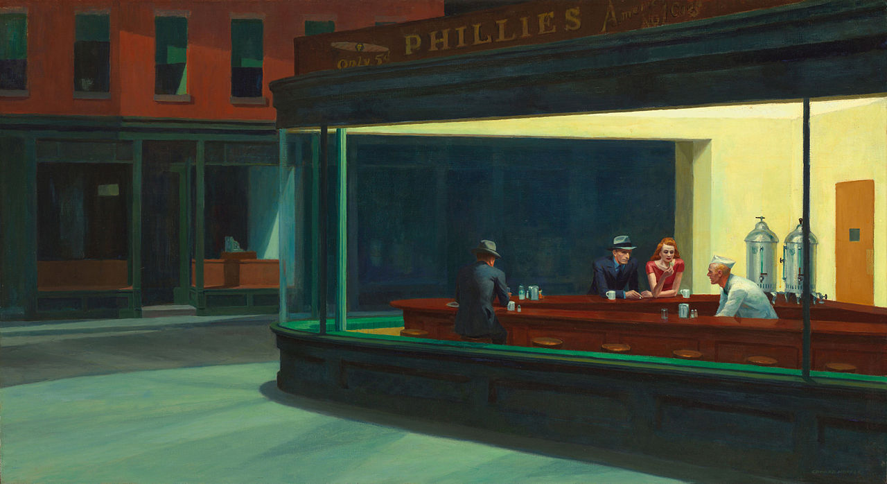
The third image analysed for this post is from Edward Hopper and is titled “Night Hawks”. This image reminds me of my youth, when I used to have cheap copies of the works of great artists in my bedroom at home and spent some time admiring the images. Now, while researching for this post, I realise that it was the lighting that used to draw me to this and other images I had that cheap copy of…
Well, anyway, going back to the subject, this image is from 1942, so it’s a jump in the time-line from the last image, but I wanted to show how the light and/or the absence of the light source in an image, still can give the sense of suspense or create a dramatic composition. Here the analysis:

> painting elements: glazed facade of a bar with four people: two men with suit and hat, a woman with a red blouse and the bar keeper dressed in white with a kitchen forage cap. In the bar, bright walls and ceiling, an orange/brown door and metal containers. Outside of the bar, street and shop windows on the opposite side of the street, representing an urban setting, which is empty.
> how’s the light: light is spread from the bar onto the street and side-walk, up to the other side of the street including the shop window and building façade.
> character of light: light sources cannot be seen. Given the multiple shadows on the sidewalk, one can deduct that there are probably several light sources inside the bar, which are not reflected onto the window glass from inside. It seems to be diffuse (light in all directions, as there are no interior shadows).
> dominant colours: blue, green, yellow and dark red.
>interesting bit: intriguing play of shadows on the street, shop window and facade. As there are no visible light sources, no one else besides the people at the bar, the scene looks quite mysterious. It also intrigues me how the shadows on the other side of the street are depicted. Where is this light coming from – falling from above? Are there street lights further away, which cannot be seen? Why is there only one shop window and window on the first floor lit?
Despite all the curious features of each picture, from the analysis above it seems clear that certain elements are common in the representation of light:
> contrast between picture elements
> shadows
> reflections
> light direction
> colour of the light
These elements can be seen but do not seem to be a requirement for an image to make a representation of light. Even if the light represented does not contain all of the elements listed above and may look strange, one can still read the picture understand the idea intended by the artist, even in very different artistic styles.
I do not intend to make a conclusion at this point. As I mentioned earlier, the subject seems to be quite extensive and deserves more attention and dedication. Keep an eye here to keep informed on the next posts on “Representing Light”
Hope you have enjoyed the post. If you have anything you would like to share or suggest for the next post, please get in touch!
See you in the next post
#thelightingtips
Disclaimer: The images shown in this article are for the sole purpose of enhancing the discussion herewith initiated and are therefore used with nonprofit educational purposes.
